

One of today's projects was to try to add a circular design to the background of a couple of divs. I was successful! I had quite a bit of help, but learned some cool things along the way.
The circular design is in two parts of my portfolio, you can see it in these cropped images below:
Someone else came up with the original circle design on their CodePen . The trick with this was to manipulate it so it became a design feature that was subtle. It was quite finicky, but with some help from my instructor and a lot of trial and error, it turned out pretty nice!
The main parts of this is that you take the design and use ::before and ::after to make it part of the background with absolute positioning, but it needs to be a child of a parent with relative positioning.
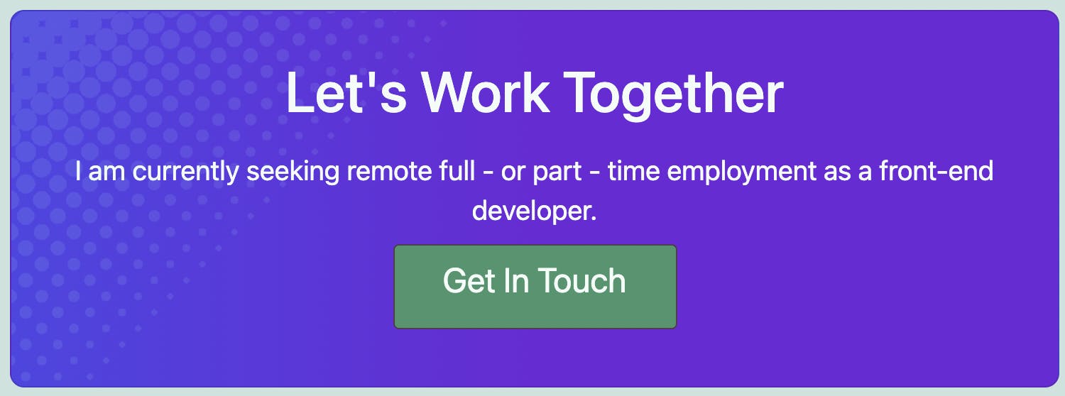
First Concern - Contact Section
I decided to try the contact section first because it was smaller and only had one set of circles to design.
I was able to get the circles to appear on the site, but they had a gap to the left between the edge of the container. Inputting a rotation didn't actually do anything. My original set up was to have the design in a class of its own called .halftone, then I was trying to do the rotation in .halftone::before which wasn't working. My instructor suggested I try a different approach, which was to use the background-image styling feature and stick .halftone CSS into there and ditch the .halftone class completely. That made more sense. He set up the logic by saying I should have a parent and a child div, and basically use child::before with the design inside of that. Swapping the margin/padding to the parent div made the child one not have that gap anymore. Not only did it work, it was a more efficient way to do things. Score! I did the contact section first, here is what that looks like:
Parent and child divs in HTML started off like this,
<div class="contact-wrapper">
<div id="contact" class="contact center">
Contact CSS
.contact-wrapper {
    padding: 40px;
    margin: 50px auto;

}

.contact::before {
    content: "";
    position: absolute;
    display: block;
    top: -6rem;
    left: -4rem;
    width: 100%;
    height: 40rem;
    transform: rotate(45deg);
    opacity: 0.1;
    background-image:
radial-gradient(
  circle,
  var(--light-teal-accent) 85%,
  transparent 0
  ),
radial-gradient(
  circle,
  var(--light-teal-accent) 80%,
  transparent 0
  ),
radial-gradient(
  circle,
  var(--light-teal-accent) 75%,
  transparent 0
  ),
radial-gradient(
  circle,
  var(--light-teal-accent) 70%,
  transparent 0
  ),
radial-gradient(
  circle,
  var(--light-teal-accent) 65%,
  transparent 0
  ),
radial-gradient(
  circle,
  var(--light-teal-accent) 60%,
  transparent 0
  ),
radial-gradient(
  circle,
  var(--light-teal-accent) 55%,
  transparent 0
  ),
radial-gradient(
  circle,
  var(--light-teal-accent) 50%,
  transparent 0
  ),
radial-gradient(
  circle,
  var(--light-teal-accent) 45%,
  transparent 0
  ),
radial-gradient(
  circle,
  var(--light-teal-accent) 40%,
  transparent 0
  ),
radial-gradient(
  circle,
  var(--light-teal-accent) 35%,
  transparent 0
  ),
radial-gradient(
  circle,
  var(--light-teal-accent) 30%,
  transparent 0
  ),
radial-gradient(
  circle,
  var(--light-teal-accent) 25%,
  transparent 0
  ),
radial-gradient(
  circle,
  var(--light-teal-accent) 20%,
  transparent 0
  );

  background-size: 1em 1em;

  /*
  If you want a vertical pattern change to repeat-x, also remember to  switch the background-positions' values. Eg. "2em 0" becomes "0 2em".
  */
  background-repeat: repeat-y;

  /*
  based on background-size value
  */
  background-position:
  0 0,
  1em 0,
  2em 0,
  3em 0,
  4em 0,
  5em 0,
  6em 0,
  7em 0,
  8em 0,
  9em 0,
  10em 0,
  11em 0,
  12em 0,
  13em 0;
  }
.contact {
    background-image: linear-gradient(to left, rgb(109, 40, 217), rgb(109, 40, 217), rgb(79, 70, 229));
    color: var(--light-hero-bg);
    display: flex;
    flex-wrap: wrap;
    flex-direction: column;
    justify-content: center;
    width: 55%;
    overflow: hidden;
    border: 1px solid rgba(0, 0, 0, 0.125);
    border-radius: 10px;
    position: relative;
    padding: 2rem;
}
The flexbox stuff in .contact were not necessary for this design to work but it was already there for something else. Actually, nothing in .contact was changed for this design except the background-image as a gradient. I haven't tested it with everything removed, so it is what it is.
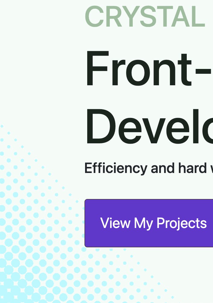
Second Concern - Hero Section
I was thinking to myself, "ok this works but what about the hero that has another set of circles? If I make another ::before then it will overwrite the first." So, I tried using ::after but the design covered up my text that was in the header. I added a red border to my box and saw that the container was really big and the entire container would rotate. I was a bit unsure at this point. I looked some stuff up, but ultimately emailed my instructor again.
Using ::before and ::after were the answers, along with playing with the z-index and overflow: hidden. I suppose this means that a third circular design is out of the question unless I attached it to a different container. As far as I know, there is no ::middle or ::extra so that must be how it is done.
For the hero, I had everything in a div with class .jumbotron, then an inner div with class .container. The jumbotron had overflow: hidden and then i used .container::before and .container::after for the adjustments.
It took a lot of adjusting to finally line things up. I changed one value, saved, refreshed the page to see the difference, and if it sucked, then I would undo the change and try something else. If I didn't really see a difference, I would use more extreme values, like going from -6rem to -30rem. Once it was really obvious what that value was changing, that was when I started to fine-tune the values a bit more. That's a similar approach I use for most of my coding experiments - do something major to get the big picture of what is going on, then fine tune. I also had another email with my instructors CSS to help me along (::after).
The circular design stayed the same, I just changed the upper part of the CSS. Here is how the ::before and ::after compared:
.jumbotron::before {
    content: " ";
    position: absolute;
    z-index: 0;
    top: -20rem;
    left: -15rem;
    width: 80%;
    height: 60rem;
    transform: rotate(-45deg);
    opacity: 1;
.jumbotron::after {
    content: " ";
    position: absolute;
    z-index: 0;
    top: -7rem;
    right: -1rem;
    height: 30rem;
    width: 30rem;
    transform: rotate(125deg);
    opacity: 0.7;
As you can see there are some subtle differences. I'm still going to play around with it a bit more but that's the first working version at least! Matching the opacity would be a good start. ;)
What I Learned
This added a whole new design level for me. In one rendition of my hero, I actually had a pattern as the background but it was too busy, even after I changed the opacity of the image. This is so much better to be able to selectively place a pattern where I want it. Now I feel like I have learned and understood ::before and ::after a bit better than when I began. Playing around with the radial gradient and z-indexes was a new thought process that I appreciated.
This was a specific design feature that was hard to Google the answers for. When I did look up ::before, it was things like adding icons before text or very general information about what it was. More searching found more information but it seems to always be linked to icons before text. I did find one resource that I bookedmarked for later because it might come in handy down the road for background overlays.
Basically, bottom line is that I was exposed more to the power of z-indexes and a different design perspective. Not only is this a great new tool for me to have knowledge of, it got me excited a bit more about the next thing to design. I want to eventually make a cooking website or something to show my recipes. That's another post for another day, but even in little code features like this, I feel like I am one step closer to being a really good programmer!